
UCL Student Statistics Visualiser
User Domain tasks
How many students are there in each ethnic group for undergraduates and post-graduates?
Has there been a proportional change to the number of students per ethnic group per year?
Which ethnic group is the largest on campus?
How many people from my ethnic group are currently studying at UCL?
Visualisation Types
Time-series, Categorical data, Relationships and Differences
Tools
Figma, Tableau, Excel
UCL is known for being a global university with a very diverse mix of students from all walks of life. With transparency from the university, ethnic group data is publicly available to be visualised. Figure 10 is the solution for accessible data for past, present and future students and anyone with an interest in the ethnicity of the students attending UCL. The following data visualisations enable users to view the relationships and differences between years and ethnic groups, to be able to interpret and understand the categorical data presented to them and to evaluate the changes in students per ethnic group over time.
UK Domiciled Student Data


The data was split into two groups, ethnic group split and ethnic group totals. The ethnic group totals included all of the split data under the relevant sub-group for each ethnicity as using both sets would not represent the data correctly. In both Groups ‘white’ was included as a whole group as there were no subgroups recorded for this group after 2009. Data visualisations that aimed to show differences, use the ethnic group totals data as they split the population more accurately.
The data was refactored to group the data by ethnic group and by year. Rather than by ethnic group and student type(e.g. undergraduate) so that data between years and ethnic groups could be compared and would be the main focus for the domain tasks we want to enable users to achieve using the visualisations. Figure 11 shows the data once cleaned and Figure 12 shows the data as percentages.
Colour was introduced to the visualisations, Figure 13 shows the coloured values and Figure 14 shows what would be described as a heat map. The colours chosen in Figure 14 might be mistaken for identity channels as the colour range uses different hues for magnitude, therefore this was abandoned. What might be more appropriate for this visualisation is using saturation as a magnitude channel to show the differences between each group. What is therefore produced is a heat map of the data.
The colour chosen was also neutral to represent the data as any incorporation of red or green could be misunderstood within this context as good or bad.
Table Data and Visual Embellishments
The heat map displayed the changes in population using colour saturation. Using this channel for visualisation within a table is helpful to visualise the differences between the data. However, saturation - colour as a visualisation choice alone might not be useful to all users to be able to interpret the data. The introduction of an area mark to display these differences between each ethnic group becomes useful as visual embellishments make data visualisation more memorable. Users can see marks and channels that help to describe the differences in the data represented as a table.
Figure 15 shows the first iteration of the introduction of these area marks, however, they overlap the value field which is an important aspect of our table data, even with the introduction of opacity but this then changes the saturation.
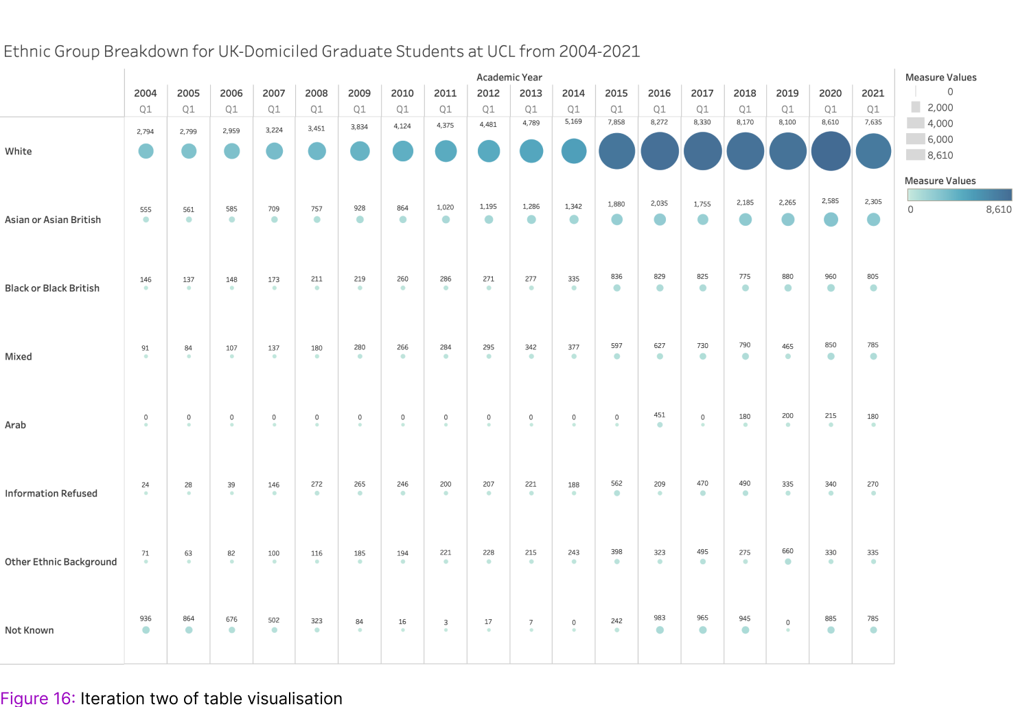
Figure 16 shows our values but the temporal aspect of our data could be visualised. The introduction of line marks can be seen in Figure 17. The lines were introduced so that the visualisation would help users see any trends in the data. It also adds more visual embellishments which should make it more memorable.


Representing Population Over Time


We want to represent data over time, the heat map is useful for showing the differences between each category in a dataset but is not the best visualisation for representing how the population has changed over time.
Figure 18 shows a line chart displaying the changes over time of the ethnicity within the graduate student population. A line chart was used so that viewers can assess the trends and changes in the population over time. The bar chart allows viewers to understand each ethnic groups discrete values as they change over time instead. Figure 19 shows an expanded view of the ethnic group as a bar chart. This can be done by selecting a line in the line chart to focus on. This allows viewers to manipulate the view, to focus on a specific aspect of the data.
As part of this bar chart, stacked bars could be used to illustrate the break down of ethnicities within each ethnic group total as shown in Figure 20. The colour luminance is used as an identity channel and would work for our data as no single ethnic group has more than five bins.

Representing Parts of a Whole


Representing data as part of a whole we can use pie charts to illustrate the population for a specific time. Figure 21 shows a pie chart where saturation is used to represent the identity channel but we cannot do this with saturation alone, especially since there are more than three bins.
Figure 22 is a better representation of how to visualise the population split of ethnic groups within UCL. The pie uses colour hue as an identity channel- using a categorical colour key. Both pie charts are labelled to show the discrete values of each population, but this is another example of using colour as a visualisation channel. Using hue for this many data bins is more beneficial for those who could also have visual impairments such as colour blindness.
Representing Parts of a Whole, Over Time


Figure 23 is a stacked area chart showing population over time, using areas as marks that represent the discrete size of the population groups. The difficulty with this visualisation is understanding the population as a whole over time - it is easy to see that the population has grown, but to compare between ethnic groups is difficult.
What Figure 24 shows is the percentages of students over time. The percentage of each ethnic group per year has a value that is represented as part of the whole population over time. This enables viewers to understand how ethnic groups have changed over time as a proportion of a whole rather than how Figure 23 shows that the population has increased over time.
Final Visualisation: Desktop Version

To evaluate the effectiveness of the figures explored to represent different aspects of the ethnic group data. Figures 18, 22 and 24 would be the basis of the types of visualisations that would appear in the UCL students statistics viewer. As this evaluation falls under Visual Data analysis and reasoning, a think-aloud observational study within a lab would be conducted; students would use the filters to complete the study based on set tasks for data abstraction. The lab study would then be followed by an interview to understand what aspects of information were retained after using the site.
The main considerations of this data would be whether users can: analyse the data(discover and enjoy), search the data(lookup, browse, locate and explore) and query(compare) by navigating, selecting and filtering through the data.